Choosing an interior paint can be tricky as so much can play into the end result, including natural light, furniture hues, flooring and interior lighting, just to name a few. We tend to stick with some tried and true neutrals—white, grey, tan—for our clients’ homes. These provide a simple backdrop to their art, their furnishings and their lives. And, when the mood for some changes hits, a neutral backdrop usually doesn’t have to be switched as well. Here’s a list of our all-time favorite colors, along with a few tips.
White: Our absolute favorite: White Dove by Benjamin Moore
Grey: Revere Pewter (it’s not too grey and not too tan; perfect as the main color of a home) is our number one, followed by Repose Gray, Lazy Grey, Sedate Gray, Mindful Gray, and Aloof Gray—all by Sherwin Williams. Benjamin Moore has two great options: Stonington Grey and Grey Owl. When choosing a grey, look at a large as possible sample for multiple days. They all have under tones of either green, brown or pinkish and will look different at different times of the day.
Tan: Accessible Beige by Sherwin Williams is a winner every time because it’s, well, accessible (i.e. works most everywhere)!
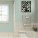
Green: Sea Salt by Sherwin Williams is soothing, calming and beautiful as a backdrop. Tidewater is a great bathroom color (so long as the tile isn’t tan).
Blue: If you’re looking for a blue, try Lullaby and Rain by Sherwin Williams and Pale Smoke by Benjamin Moore.
Pink: For pink, go light. Benjamin Moore’s Mellow Pink is lovely (consider having it mixed half tone for very light and subtle).


Sorry, comments are closed for this post.